Pages

Sunday, 30 October 2011

Pink and Green

Interesting colour combinations are one of the most enjoyable aspects of card-making for me. The inspiration for them comes from so many sources: the preferences of the person the card is for, the colours in a paper, image or embellishment or those suggested by a theme. Sometimes the combination is challenging, particularly those that I haven't used before or wouldn't usually think of putting together, and at other times they just seem natural and irresistible. This month's Crafter's Companion Challenge fell into the latter category: pink and green is one of my favourite combinations, due, I think, to its prevalence in nature.


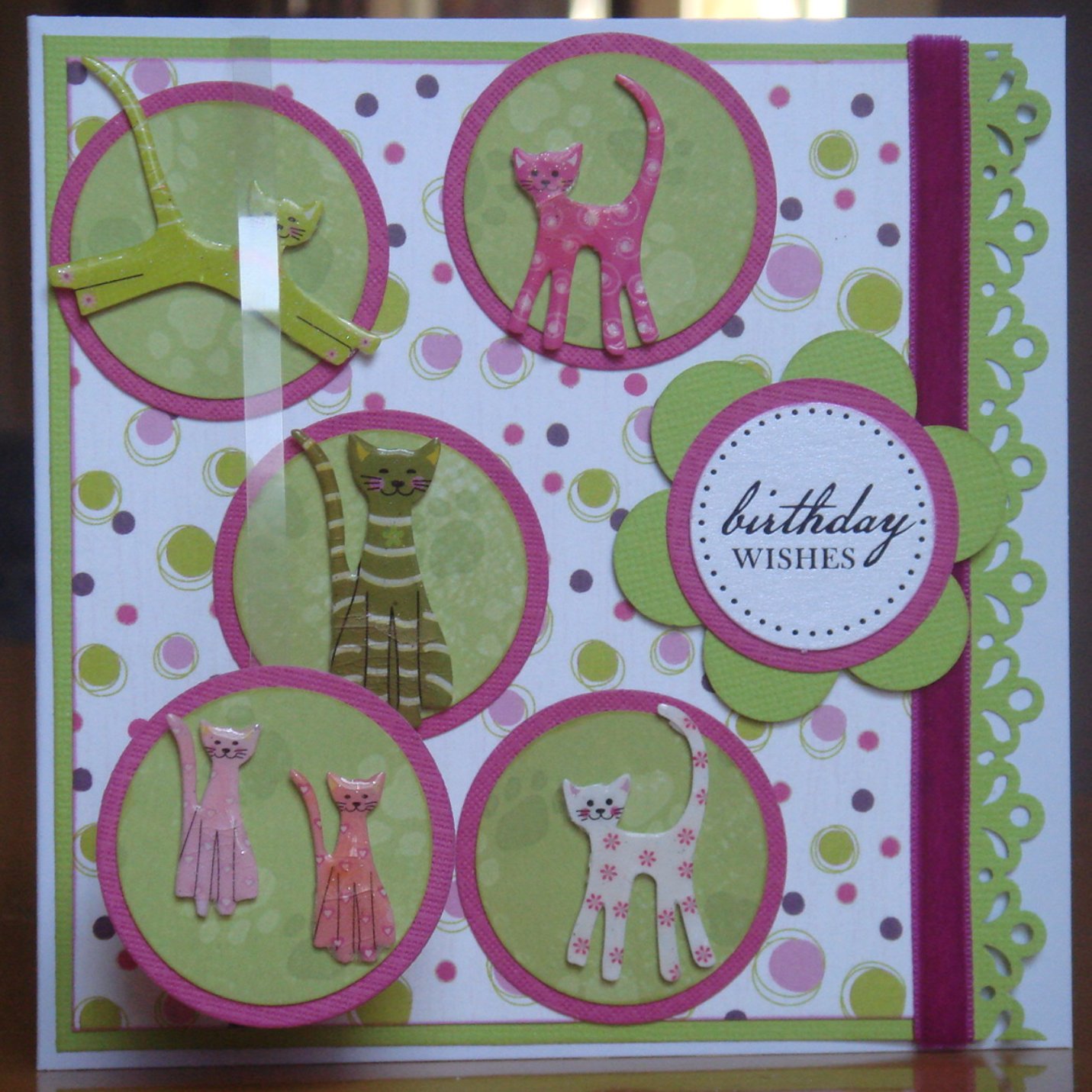
I made this card for my niece's eighth birthday, which was earlier this week. It uses quite bold shades of lime green and a deep purply-pink. The combination of its design and theme (cats) is one that I've been evolving over about a year now. Although I was happy at the time with each of its first two incarnations, it was the third, which was a birthday card for a similar aged girl about a month ago, that I felt was when I got it just right. (The three previous cards are at the bottom of this post.) I only tweaked that third card slightly for this fourth card. I think this will be the last time that I use the design for a cat-based card, as I've run out of cat obsessed friends and family, but I can imagine revisiting the layout for a different theme. Not really sure why I've only used the layout for cat cards up to now ...

The cat embellishments are Papermania die-shapes, very aptly titled "Fun Cats", each of which I heat embossed three time to give them gloss and depth. It's quite a fiddly process for such small pieces but worth the effort and I find an emery board is very useful to smooth down any rough edges. As has become my habit for cards recently, I attached one of the circles (bottom left) to a 5 mm strip of acetate, and tucked the other end behind the backing card, to provide some additional dimension and movement.

These are the three earlier versions of this card theme and content, which have been made separately over the course of about a year. Seeing them together like this (for the first time), I find it interesting - and encouraging - how the layout and techniques have developed over time, but surprising that the colour combination has varied so little.

Friday, 26 August 2011

Number One Team Whitewash

Hard to feel able to do justice to the England cricket team's achievements during the recently concluded series of Tests against India. Perhaps a collection of a few of my best memories - in words and photographs - is the way to go.

Victory at Lord's in the First Test, by nearly 200 runs, was somewhat (bit of an understatement) marred by the inability of a "friend" to deliver on his promise to join the fifth day ticket queue at the crack of dawn. Thinking back now, he said that it was so that I needn't curtail my beauty sleep … surely a clue there to a flawed character? My wrath at finding that he'd been in the St John's Wood area since a fairly suitably early hour but hadn't actually felt the need to join the queue was amazingly quietly controlled. I walked the considerable, and twisty turny, distance from the East Gate to the end of the queue just for the hell of it and then turned on my (high) heel and when home to enjoy the play and the victory in the comfort, warmth and sunshine of my back garden with TMS and Tash as perfect company. Lessons learned: (a) if you want something done properly, do it yourself, and (b) never trust a Middlesex supporter (even if he claims to support Surrey too)!

The Second Test, at Trent Bridge, delivered victory well inside four days by 300+ runs, and with a hat-trick from Stuart Broad thrown in along the way. It seemed difficult to believe that England wasn't going to win all four and take the Number One status from India … but harder still for me to forget how many times in the past seemingly simple plans had gone so badly awry in the hands of England cricketers.

My best moment of the Third Test at Edgbaston - and possibly the whole series - came during the afternoon of the fourth day when I released that I was watching England play cricket without any fear that it would all go horribly wrong. An unusual, but very welcome, feeling. Long may it last. The pain, despair and misery of so many England collapses, thrashings and humiliations over the years were erased as England cruised to 710-7 and from there to a four-day victory by an innings and 200+ runs, picking up the status of Number One Test Team in the World in the process.

The Fourth (and last) Test was my "home" match at The Oval. I had tickets for the first, third and fifth days and was really looking forward to sharing the first two of those with my bestest cricket girl pal (and her brother-in-law on the Saturday).

Not the weather I ordered.
Bananas beat All-Comers
The weather gods, however, had completely different plans and conspired, with an elegance of timing, to deliver rain to SE11 on the stroke of lunch both days. On Thursday, we stuck it out while being entertained by an impromptu Bananas v All Comers match at the front of the Lock Stand, before admitting defeat and heading home, damp, cool and expecting much better on Saturday.

Somewhat churlishly, I admit, my best moments of the match probably occurred on Friday, when I was listening/watching at home. Both Bell and Pietersen had the decency to get their centuries, so I didn't have to stand and applaud my two least favourite current players (revisit the end of Mr Thorpe's international career to appreciate the reasons). Nuts, who I still can't recognise as a Surrey player, went one further and got out before the close of play so I didn't have to see him bat "in person" on Saturday.

Just a tad too wet and gloomy for play
Day 3 started off OK weather-wise but the rain again came at lunch and we gave in after a couple of hours and headed home. In what felt like a spirit of blind optimism, I got a re-admission stamp on my wrist (which took three days to wash off). This actually turned out to be shrewd fore-sight as by late-afternoon Kennington was basking in sunshine under clear blue skies and play resumed for a couple of hours. During which Tendulkar came in, was cheered almost constantly by the huge Indian contingent in the crowd and then got out, without achieving that hundredth hundred.

The 80th (& final) Indian
wicket of the summer falls
My heels and I enjoy the space
and view of the Pavilion Top
On Monday (Day 5), I started watching in the crowd-packed stands but soon defected and traded in my general public ticket for a Member's Pavilion Seat and watched the rest of the day's play and enjoyed the victory, by an innings and a handful of runs, from the lofty heights of the Pavilion Top, where I felt much more at home - and had much more room to stretch out my legs. Apart from the victory, my highlight of the day was waving my England flag and "singing" Jerusalem three times. Shame practically no-one else seemed to know the words and sincere apologies to all those in sufficient proximity to me to have to suffer so many off-key notes.


What a way to treat Veuve Clicquot!
The ground staff was not amused by
thecelebratory red & white streamers.
Despite the Indian cohort of the crowd hoping against hope for a Tendulkar miracle, in the end England took only slightly longer to get the last seven Indian wickets than they did to finish off, and casually discard, their celebratory bottles of Veuve Clicquot. Oh well, having completed the first series whitewash since 1959 (or some such date) and becoming the Number One Test Team in the World (did I mention that already?) perhaps they can be excused such a minor aberration.

So, that was it, the international summer finished - unless one counts ODIs and T20 matches, which I don't this time since I'm going to be out of the UK for almost all of them - and the usual feeling of missing it already descended. This time, of course, it was meeting the undiluted joy of such a marvellous all round performance, which I fully expect to be repeated throughout the forthcoming winter, just like the last one. Hmm, this winning thing is becoming something of a habit - and a very enjoyable one at that. And I feel that I've really earned if after so much suffering over the past 30-ish years!
Sunday, 7 August 2011

Sweet as Sugar

This week's Docrafts Creativity challenge is an inspiration one, with a nostalgia-provoking photograph of some Love Hearts sweets. When making cards for challenges, it usually helps me to have a recipient in mind (and stops me accumulating even more cards waiting for just the right occasion …). For this challenge, the recipient will be my mother. Had my father been alive, it would have been my parents' Golden Wedding anniversary next week. I wanted to send my mum a card to let her know that I was thinking about her especially at what could be a sad time. "Love You" seemed just the right thing to say.

The colours in the photograph immediately reminded me of some paper that I had in my stash, so I was off to a speedy start. I thought I'd repeat the dangling of an element in front of the main card, which had worked well for my nephew's birthday card a couple of weeks ago. I'd tried to explain orally how this looked to my mother but didn't think I'd got it across all that well. Now I'd send her one of her own and hope that makes it clearer.

The background paper was quite busy so I didn't want to make things too complicated but the pair of "danglers" wasn't enough on its own. Also, I wanted to include something that represented the sweets. I punched about a dozen small hearts from various parts of a multi-patterned paper and intended to punch their circular backings - but my smallest circle punch was not quite big enough and the next smallest was too big. A kind of a Goldilocks moment. Nestability die cuts to the rescue. The smallest circle was just right and so I embarked upon repeatedly putting textured white card through my Cuttlebug. It was a great boon that the machine works in both directions, although re-assembling the plate sandwich for each pass was much more fiddly and time-consuming than using a punch would have been … but that wasn't an option.

I inked the edges of everything with a really old tired pastel pink inkpad that is always in my essentials box - such a useful colour. It has a bit of a chalky feel to it, which seemed to match that of the sweets - at least in my memory. Can't quite recall how they tasted: not getting further than sugary! Were the different colours differently flavoured?

The small hearts were stuck flat on the circles, which were then mounted, in as random a manner as I could manage, onto the background paper using 1 mm foam pads. The acetate strips for the "danglers" were sandwiched between two larger punched hearts and secured to the card behind the backing paper. A single small heart mounted with a foam pad on one heart and a rub-on sentiment on the other finished off the card.


Quite a simple, but effective, card, I feel. Odd not to have used any ribbon; I found some suitable colours but they seemed unnecessary with so much stripy paper. I'm very pleased with the colours: I like it when pastels are bright and vibrant rather than really pale. And - an unusual outcome for my cards - it should travel through the post really well. Think Mummy will have a smile when she sees it. She's doing the church flowers in Daddy's memory this week and, most appropriately, has chosen a gold colour theme. Think it would have been weird though - and not in keeping with the challenge inspiration photograph - to use gold for this card. I did love making all those men's cards recently but it is nice to be back to prettiness as well as style and design.

Saturday, 23 July 2011

(Another) One for the Boys

Despite making cards for men being universally considered as the hardest task, I've just had a second success in one week. On Monday, I got inspired by this month's Get Funky! Boys Boys Boys challenge and made a card for my cousin's birthday next week, along with several spares for upcoming male birthdays. Today, having wimpily abandoned my plan to watch live cricket on the grounds of less than perfect sunny warm weather and the probability (which has been realised) of a Surrey defeat, I settled down to listen to the Lord's Test, watch Le Tour de France time trial and see if I could come up with something for the Docrafts Creativity challenge that Katy had set this week.

Katy alternates sketch layout challenges with inspiration challenges. This week's was one of the latter, which provide opportunities to be as creative as one likes, as long as there's something to link the finished product with the original photograph. Katy, either cheekily or cleverly, gave us a very Christmassy photograph, which has divided the entrants so far. Several took encouragement to start on their festive card making; others moaned that it was far too early and did anything but. I wasn't in the mood to make a Christmas card but didn't stand firmly in the latter camp either, having very happily knocked off 40-something of this year's Christmas cards in early-January.

I did like the five circles in a row component of the photograph and, particularly, the single element stood forward of the background. It came to me that each of the circles could bear a letter of someone's name (as long as it was five letters long) and that the forward element could be attached to the card on a strip of acetate, and so dangle in front, rather than being fixed flat. Running through my friends and relatives with appropriate names, I quickly came to my eldest nephew, whose birthday is in November. So, sort of planning ahead, but not quite as far as Christmas (155 sleeps to go, by the way). I hadn't necessarily intended to use the red and silver colours from the photograph but as my nephew's a Liverpool fan (no idea why; he lives in Somerset and his father supports Man City), it seemed a good plan.

Having decided to include letters, I then had to produce them. I thought about using some wrongly coloured chipboard ones as templates and cutting them out but was fearful that I wouldn't be able to do it neatly enough. I then remembered that I had bought a set of Papermania alphabet stamps a while back on the grounds that they were a craft box essential. So essential, of course, that I had never used them and almost forgotten about them! When I tracked them down, I also found an unused round "Happy Birthday" stamp, which gave me the start of an idea for the dangly component.

Progress from there was swift. I stamped the letters on textured red card with VersaColour silver (92) pigment ink and heat embossed them with Crafter's Companion metallic silver embossing powder. That combination of products gave a lovely effect, even though only single embossing was practicable. I backed the red circles with scalloped circles of textured matt silver card, which seemed to complement the embossing better than shiny mirror-board. I did indulge in the latter to back the sparkly red background and for the triple stripes, which seemed to add an appropriate sporty touch and were far easier to cut than I'd imagined. A pearly red gem in each of the cutaway corners and the basic card was done.


This just left me to make the dangler (for which I'm sure there's a more formal name that I don't know). Using a bit more mirror-board was an easy decision but I wanted to add some depth and weight to help it hang well. It occurred to me that fun foam might work well but I wasn't sure how to cut a circle from it. I knew that punches weren't up to its thickness but I wondered whether a Nestabilities die cut in the Cuttlebug might work. The answer, once I tried it, was with ease: result! I needed something to go in the dangler's middle: firstly to finish it off and secondly as I had got a smudge of silver ink there from the stamp. A silver sequin topped with a clear star gem did the trick. I toyed with adding a little ribbon bow but decided it wasn't quite the right colour red, which saved me the trouble of deciding whether a bow on a male card was appropriate.

Having visited the Crafter's Companion website to make sure I'd remembered correctly about the apostrophe and where to stick it (something of an obsession of mine), I discovered that their monthly challenge was One for the Boys. I thought I'd put this card in for that as well, as an example of their marvellous embossing powder, which I love. My only gripe with it is that the container lid isn't removable so getting the excess powder back into the pot - we crafters hate to waste anything - is a fiddly and time-consuming task. Perhaps the next release could have a screw top lid?

OK boys, you've had a more than disproportionate amount of my crafting energy and attention recently. I will gladly admit to having enjoyed it greatly, and having discovered layouts, styles and combinations that I can readily use for many purposes, but the next projects will be firmly focussed on the girls. They'll have to be: September is bursting girlie birthdays.  BTW, did you work out my nephew's name yet?

Thursday, 21 July 2011

Lions Roar No More

Well, we all know - don't we? - that Twenty20 cricket isn't real cricket … except, of course, when we recall that England are the current T20 world champions. This frame of mind comes from Surrey's exit from the 2011 domestic competition at the group stage. Huge disappointment, as with just two of the sixteen matches to go, the dizzy heights of a home quarter-final was on the cards. This had an added excitement for me, as it was feasible that this would have been against Lancashire and occur during the tiny five day window when a really good mate, Manchester born and bred but now exiled to France, would be visiting. Through my daydreaming, I should have realised that that was just too much expectation to place upon the shoulders of Rory's young Surrey lions.

I'd missed the first half of the campaign while lazing for most of June on a Greek beach. Several of the fixtures had been declared no result due to inclement English weather. Things were looking pretty open. My first match, three days after returning, was on a roasting hot afternoon at Beckenham. I appreciated the chance to top up my suntan, but a Kent victory was unwelcome. This was followed five days later, in the company of my utterly bestest cricket girl pal, by a comprehensive defeat at the hands of the Somerset cider-boys. Having grown up in Somerset, and with cricket mates living in Taunton, this was also not what I wanted to see. Apart from such terrific company, the highlight of evening was wearing my Ashes winning t-shirt. Not subtle or polite, I agree, but effective.

At this stage, it seemed clear that the T20 trophy was not going to return to the Surrey cabinet this year. Then came our glory week: three fixtures, at three different grounds, in five days, all of them victories and I saw all of them live. First, Monday evening at Whitgift School in Croydon: got really tight, felt Sussex had the upper hand but they kept dropping catches and Surrey squeaked home. Next, off to The Home of Cricket, in the company of a Middlesex member so with a view from the Pavilion. Marvellous experience and a great victory for Surrey.

Two out of three. Now, as we well know, Mr Loaf believes "two out of three ain't bad". I have never agreed with the man - fabulous performer though he is (well, apart from the time that I saw him collapse on stage at Wembley): two out of three ain't good enough in my book. And Surrey agreed. Back at The Oval the next night, watching for the first time from the top of the OCS Stand, Surrey pulled off a comprehensive trouncing of top of the table Hampshire. Yes!  Three in a row.  This was it, surely we were going to get our home quarter-final.

The ECB scheduling, for reasons known only to itself, threw a four day Championship match in next. We spectators took deep breaths, got pleasantly lulled by the soporific effects of the grown up game after so much hectic T20, and Surrey pulled off a tense and close victory, on a very cool fourth morning, against Kent. This backfired quickly the following evening, as Kent took their revenge and beat us easily. OK, the home QF was off but if we overcame Sussex the next day, we would still be through. Embryonic thoughts about a trip to Hove to watch were abandoned quickly as the news came through that it was sold out. Probably a blessing as Sussex reversed their Whitgift defeat and the Surrey Lions roared no more.

Plenty of talk on Twitter from deluded optimists pleased by a perceived improvement from Surrey's performance last year. What rubbish. In a knock-out tournament, what matters is getting through - not how well or poorly the team plays. We'd failed and from my point of view, the glass was utterly and completely empty. Still chastened by the crashing down of my T20 dreams, I'm yet to climb to wild heights of optimism about our CB40 one day chances. Yes, we won our first five matches. The sixth last weekend was a casualty of the weather. We're top of our group. All positive, so why am I not looking forward to the first weekend of September and the semi-finals? In fact, I have so little hope of such a prospect that I'll be back in Greece then. Perhaps having, so nobly, sacrificed the chance to see victory will ensure success? Yes, that's the plan. Come on The Rey!

Monday, 18 July 2011

Boys Boys Boys

This month's Get Funky! challenge from Funky Hand is "Boys Boys Boys". Cards for men are almost universally held to be the hardest to make but with two male relatives having birthdays in the next few weeks, this was a timely challenge for me. As usual, the wonderful Anice provided a fabulous freebie paper and, although there is no obligation to use it, the colour and pattern combination made it irresistible.

Learning from my experience with this week's Docrafts Creativity challenge, I decided to go for simplicity in design but also to have another go at using the previous unfamiliar combination of squares and circles. The colours of the freebie paper came from the Jovial Man collection on the Papercraft Factory Colour Me Happy CD and I chose another pattern from that as my second paper. After that, it was simply a matter of cutting out squares and circles, inking their edges (obligatory!) and matting them onto complementary card. Anice had included stars on the freebie sheet and although I didn't use those, I liked the idea (and sentiment) of including a star so punched one out of card, inked it, topped it with a button and stuck it on. I was very glad to find that I had just the right colour of ink and style of stamp for a casual "Happy Birthday" greeting, using another of the collection's papers. The wooden mini-peg was not part of my original design but, having found it in my button box, it seemed to provide a slightly quirky yet appealing embellishment. Albeit one that's not necessarily going to travel well through the mail …

Pleased with how the finished card looked, I made a few more along similar lines using other patterns in the collection. Although blue and green is a combination that's not "supposed to be seen", it's one that I've always really liked, being based, it seems to me, on prolific colours in nature, and certainly works well for men. Thanks to the Get Funky! design team for the inspiration; that's my male card needs sorted for now and a few more to come, which is a great relief. Lots of female birthdays coming up at the end of the summer: any chance that next month's challenge could provide a useful starting point for them?

Squaring the Circle

Good weather, cricket and a holiday have distracted me from card-making for too long.  With Surrey out of the Twenty20 and the UK summer reverting to the usual cool, damp and dull weather, staying in and crafting became not just a feasible option but also a very attractive one.  Too much time pressure when making cards rarely, if ever, enhances my creativity but a deadline of some sort does help focus my mind.  I didn't have any particular cards in hand for the family and friends with birthdays coming up in the next month.  And, after a hectic week in mid-April, I also haven't done all that well (understatement) in taking part in online crafting challenges.  A wet Sunday afternoon (about which a complaint has been lodged with St Swithin on the grounds that his saint's day at the end of last week had been gloriously sunny, hot and, most importantly, entirely dry - at least in London) offered a good opportunity to address both.

The Docrafts Creativity website has a new paper-crafting challenge each Tuesday, with a Monday evening submission deadline.  I'm impressed by those who are able to get cards in on Wednesday or Thursday but suspect that I'm amongst the majority who submit late on Sunday or during Monday.  This week's challenge was a simple sketch outline involving a square set on a circle.  This is not a natural combination in my card-making as my preference is to keep curves and angles separate.  I had a pink and green colour way in mind - perhaps to balance the greyness outside my window.  A suitably shaped and sized topper in each colour came readily to hand, along with some co-ordinating papers.

Although I am pretty hopeful that the finished card will go down well with the intended recipient, I'm not entirely satisfied with the final card.  I like the combination of paper colours and patterns and think the ribbons work well, although it's a shame that so little of them remains visible.  I had originally intended to avoid using the card-maker's staple of mirror-card.  However, the papers alone looked a bit flat and adding just a little bit of silver card as a matting layer behind the topper and as flower and gem embellishments seemed to lift the design in a pleasing way.  I think the card is a bit cluttered and would probably have benefitted from being a little bigger overall.  The papers seem to dominate and distract from the topper itself; probably something less complex would have worked better.  However, this combination of a circle and square has a potential that I wouldn't have thought of myself.  With a simpler, and completely square, topper - perhaps an initial or a single shape - it would work well and I aim to try a variation along those lines.

I suspect that there is no creative project with which the creator has ever been entirely satisfied.  Looking back over my back catalogue of cards, I can see plenty of positive evolution in my style, designs and skills.  Those who have been at this much longer than I have frequently comment that they are always discovering and learning something new.  That's a big part of the joy of it and I trust it long remains so. Although I suspect (or is that hope?) that cricket and good weather will get in the way of me taking part in the weekly challenge for the next couple of weeks.