Pages

Showing posts with label Card-Making. Show all posts

Friday, 21 December 2012

Christmas Crafting Challenge

Almost my entire crafting stash - along with almost all of my belongings - has been "safely and securely in storage in an ex-dairy in Peckham" (if I have a pound for every time I've said that …) since July pending the completion of building works on my "new" (mid-17th century) home, which will include a craft studio in the garden: both with glorious country views. Somehow, the first lot of builders never quite got round to starting, let alone finishing … but fingers crossed for the new crew from early-January.

This somewhat unsatisfactory situation has caused no end of "challenges" and frustrations and as the days, weeks and months passed by I began to fear that I'd have to resort to buying Christmas cards … or not sending any. Neither option was palatable to me, so at the end of November I gritted my teeth and challenged myself to come up with a straightforward design. One that could be easily and quickly produced, using only the few bits of stash that I'd fairly randomly selected in the hasty packing up of my old home (exchange to moving out in less than a week … utter madness: don't do it.) I didn't quite manage any of that: the design got a bit complex, I had to buy a few key things, the prototype took ages to produce … and then I found I'd run out of double-sided tape. So, it was Monday 10 December before I made the first card … The last posting dates for Australia and Canada had passed, the European one was fast approaching and even the UK deadline was only nine days away. Oh, and I was going to be away from home for three nights that week. For the first time ever, I managed to get organised enough to take some crafting stuff away with me and so was able to spend a happy few late night hours finishing the first dozen, while liberally coating a London hotel room in glitter, which was a nice addition to my face and jeans, the fireside rug and the ever non-complaining cat.

The shortage of daylight hours meant I had little time to colour match. Usually, this wouldn't have been much of a problem thanks to my marvellous natural daylight OttLite, but - you've guessed it - it's "safely and securely in storage in an ex-dairy in Peckham". (It's very important, by the way, to consider the architectural features and history of the building when choosing where to lock up one's belongings!) As a result, one of the cards that is mainly green has ended up with bluish gems but it's probably only me that's noticed. Certainly my mother didn't when I gave it to her … but she might have been being maternally polite and supportive as she's the one who really knows the anxiety that being separated from my stash has caused me. I've always said that crafting makes a huge contribution to my mental stability and the last few months without this opportunity have really proved it.

What I definitely couldn't have managed without were the Oh Come All Ye Crafters paper download collections from Funky Hand. I think I probably used all of them, making four cards in two different colourways from each … and then, as I got more confident, I moved on to their Papercraft Factory Twelve Crafters Crafting collection and picked the more unusual - and less traditionally festive - colour combinations.

Eight days later - six, really, if you exclude the two non-crafting days in London - I had 56 cards finished … and, amazingly, most of them written. As I'd posted several as I went along, - and, despite the dire warnings from the pessimistic woman in the King's Cross Post Office, the last one to Greece made it in less than a week - I didn't have to a chance to enjoy them all in their entirety, which was a bit disappointing. However, on the plus side, this avoided the usual feeling I stupidly get of being traumatised at the thought of being parted from any of them!

The design was far too complicated … but I needed to find something that was satisfying and although I tried it without the diagonal banner, which was very fiddly and comprised of four different layers, it just didn't feel enough. If I'm being really picky, then I wish the snowflake topper had been a little bit bigger: but I was constrained by the size of punches that were available to me. Since the papers were going to be the stars of the cards, I splashed out on some Crafters Companions Satin Finish Printer Paper, which made a huge difference with its subtle sheen. Although at 100 gsm I worried that it might mean the cards were too thick and/or heavy to get away with a normal stamp … but a really delightful woman in the Kingland High Street Post Office measured and weighed my prototype and reassured me on that front.

And, if I had any lingering doubts about the difference that running a faded black inkpad around the edges of mats and layers makes, I never will again after seeing what a lift it gave to them all, even the almost entirely black printed papers. Just getting rid of that tiny hint of white on the cut edge is a big (and important) part of it … but it's the little - even occasionally smudgy - border on the front that is the total transformer. Getting the resultant ink off my fingers, face, jeans, rug and the cat was another challenge …

So, probably the hugest crafting challenge I've ever faced, but one that I'm so glad I didn't duck, really enjoyed undertaking (after the first four, which proved to me that the design worked) and feel pride and pleasure at having completed. A tiny bit of me wishes that I hadn't used such an effective and simple design for my Christmas Card Forest last year, as that would have been great for this year's circumstances, but I had and there was no way I could've repeated it … someone other than me would have noticed, surely?


So, next year? Well, hopefully, with a dedicated - and fully equipped - studio in the garden due to be finished by late-Spring, it will all be a whole lot more relaxed, get started sooner and place no limits or restraints on my imagination and design … Who knows what that might result in? Watch this space …

Monday, 23 July 2012

Just A Number

This month's Get Funky! Challenge (as set by Jackie) feels like a particularly bossy one: "use a large number" and "no images of any kind" were among the instructions, along with the basic one to use at least one Funky Hand paper. However, not a bad one for me, as I need to make a couple of 70th birthday cards for men. Not having to struggle to find appropriate images feels rather liberating.

My Funky Hand papers came from the Birthday Dude collection of the Happy Happy Birthday Papercraft Factory CD. I used the sentiment paper (printed full A4 size) for the background and then four of the five woven-effect papers (each reduced to A6 and printed together on a single sheet) for the "ribbons" around the rosette. A bit of purple pearlescent card and pale turquoise corrugate card from my stash added some texture. The "70" (which, I admit, isn't all that large) was stamped in black ink and then heat embossed with sparkly black embossing powder.

The "ribbons" are 8 mm strips of paper, cut to 5 cm in length and stuck onto a circle of card. I thought about inking the edges all the way around them but that felt too fiddly, so I settled for just inking the ends with black after I'd randomly angle cut their ends.

The "Happy Birthday" banner down the left hand side was a last minute addition to cover up where the ink had smudged. I have a feeling that I didn't using the right sort of paper for my printer … but it might just have been that my hands weren't entirely dry after I'd attempted to wash off the liberal coating of black ink that they'd picked up along the way.

The second card, which I actually made first, has - so far - survived trauma by ink smudge, so I've left it without the additional sentiment banner. It uses papers from the "Cake Anyone" collection on the same CD. I think I know which card I intend to send to which birthday boy, but I've got about three weeks in which to change my mind (probably several times over).

Not an entirely successful card-making session, but my first for ages and I'm glad I gave it a go. My inspiration felt a bit slow - but perhaps that's because the English summer has at last arrived and it's about 28°. As well as getting involved in a challenge again and getting these two cards done, it was an attempt to distract myself from the distress of England's abysmal cricket performance at The Oval (which ended in the inevitable huge defeat just after I finished the cards) and the on-going anxiety of whether today would actually (after getting on for six weeks) be the day on which the contract was exchanged on my house sale. The latter didn't actually happen - surprise, surprise: not - but the purchaser does at last seem to have agreed to a completion date, which although far from convenient for me, is probably achievable.

Now I have to face the trauma of packing up my craft stash and putting all of it - bar the essentials - in storage for a few months while the building work on my new home is completed. Nigh on impossible to decide what is and isn't a crafting essential, but I have one fairly modest sized box into which they will have to fit. Trouble is, I had to open at least ten boxes to find the bits to make these fairly simple cards. In the long-term, my new home will have a dedicated craft studio with gorgeous open countryside views so I'm holding on to the thought that the eventual outcome will be worth the not inconsiderable pain and anguish it's taking to get there!

Tuesday, 31 January 2012

Crafty Types

Still in a mood to combine crafting with typography, following on from my Thank You! and January Blues entries for the Get Funky! challenges, and building on the huge inspiration from Simon Garfield's book Just My Type. As planned when I made the thank you card, I adapted the mini tags design for February birthday cards for my mother and two of my friends.


The colour combinations were inspired by Funky Hand Papercraft Factory CDs again: the spotty designer papers from the Blissful Baby collection on the Colour Me Happy CD and the Come What May collection on the Craft the Year Away CD. I used colouriser software to produce plain papers matching the main colours and found co-ordinating pearlescent card and eyelets from my stash, along with thin black waxed cord.

I had such fun looking through the fonts I had recently collected from Urban Fonts to choose just the right ones for each name. They include Times New Romance, Type Block, a Papa, Algerian, An Akronism and Curlz. I struck really lucky when stumbling across Anonymous Clippings, which was perfect for the sentiment.

Most enjoyable though these cards were to make, they were fiddly and time-consuming, although I was faster when doing two together and having learned from the experience of the thank you card. They are certainly quite busy, especially as they are only A6 in size. I am really pleased with the results, which is almost exactly how I envisaged, although I am struggling with a word or phrase to describe their style. There are elements of shabby chic, with the Kraft card, colours of the Mummy card, eclectic fonts, inked edgings and doodling. But the colours of the Hazel and Karen cards seem rather too lively for this description … and remind me of how an ex-boyfriend described my favoured kind of pop music as jangly. So, in the absence of anything better, I'll settle for jangly shabby chic for now. I think I'll be making more to this design … for people with names of a suitable length.

I also used the Times New Romance font for my brother and sister-in-law's initials on their anniversary card, which might become the basis for several other anniversary cards this year. Again, it uses a Funky Hand designer paper: this time from the Minty Madness collection. The charm embellishment was made from leather cord and beads that were lurking in my stash. I moved away from shabby chic to something rather cooler and more sophisticated (I hope), and used holographic mirror card, which I think works well with the Funky Hand papers. I struggled with how many little heart gems to put in the bottom right hand corner. For an anniversary card, two seemed to be the appropriate number, but I gave in to the pull of the crafters rule of three and think the balance is better for it.

Saturday, 21 January 2012

January Blues

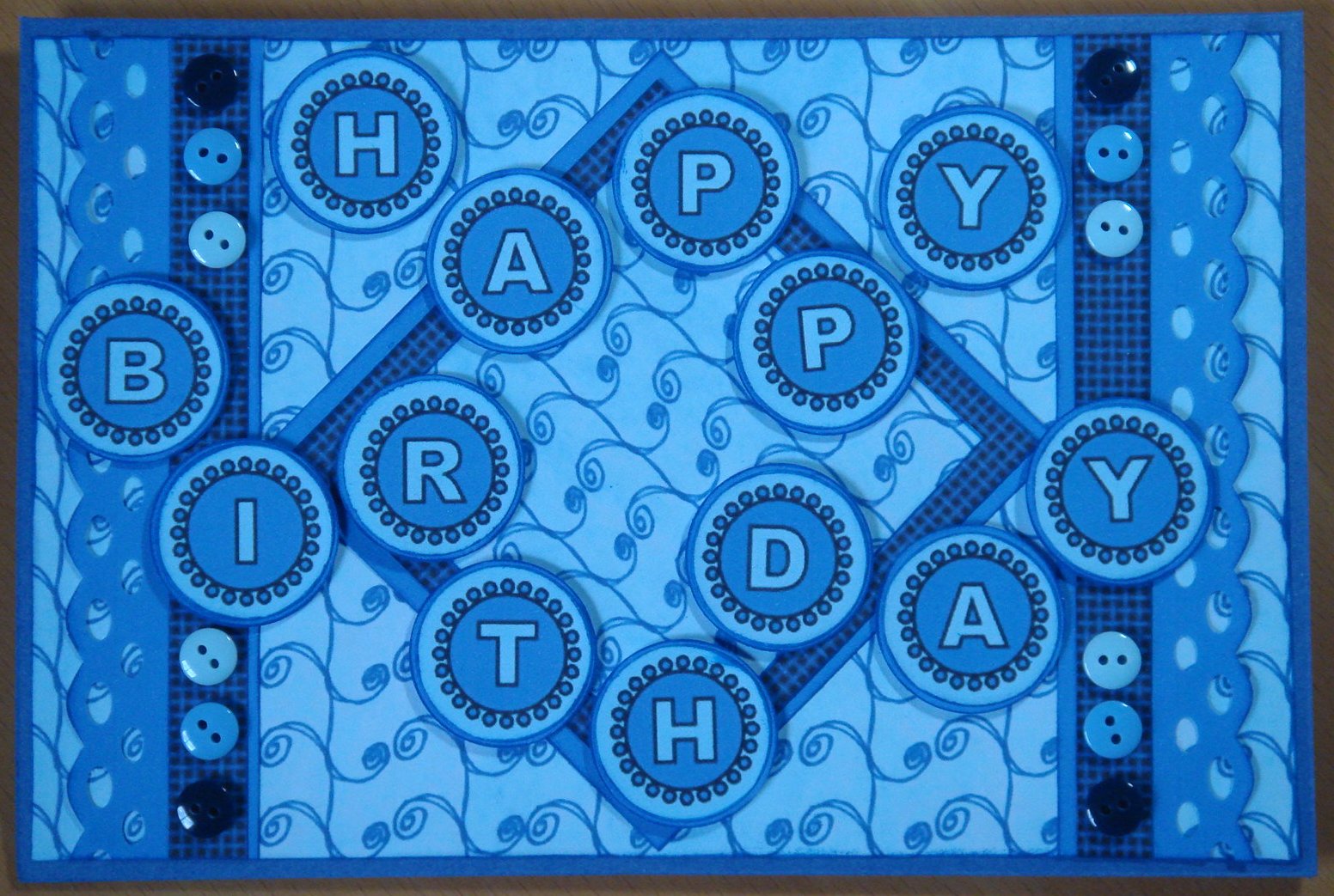
When I started thinking about this month's Get Funky! January Blues challenge, I still had last month's Thank You! challenge in mind, particularly the typography that Anice had used on the freebie paper.  I wanted to include the letters of Happy Birthday in individual circles and spent a very happy hour or so hunting online for just the right type to use until I stumbled across 4 Yeo In (from Urban Fonts), which seemed perfectly suited to my plan.


For once, I didn't use the freebie designer paper - although, of course, I have stashed it away for just the right rainy day! - but instead chose two papers from the Birthday Boy collection on the Funky Hand Papercraft Factory Happy Happy Birthday CD.  I manipulated one of them in the Workspace on the CD to have the same design in two different sizes and used another graphics package to colour match the sentiment to the backing paper.

Having printed the sentiment, I commenced upon the time-consuming process of cutting out the letters using a Nestability and my Cuttlebug.  Since there were thirteen letters to cut, I had hoped to be able to use a punch, which would have been soooo much quicker, but didn't have one in the right size.  I was able, though, to use one to cut out the backing circles to give a narrow darker blue border.  Then it was on to the fun messy task of inking the edges of all those little circles and layering them up.  I used a border punch to produce some paper lace and made a 1 cm paper ribbon.  I originally tried layering a circle in the centre of the card but it seemed to take up too much space so I swapped it for a square.  More edge inking and layering followed and I was then ready for assembly.

I chose little buttons over paper flowers for the embellishments and decided not to add thread through their holes, as it looked overly busy.  For the same reason, I put the three colours of the buttons in the same order on each corner, as I couldn't make a random arrangement of them look random.

Since it was obvious what the sentiment said (I hope!), I decided that it would be fun to arrange the letters in a bit of a haphazard manner, which helped a lot as the two words are of such different lengths, and mounted the circles on 1 mm foam pads to give a bit of depth.

IMHO, at least, a simple, pleasing (and certainly blue) card, that could be sent to a guy or a girl, although I'll probably go for the former … and, amazingly, finished, blogged and entered well before the challenge deadline.  That gives me plenty of crafting time to devote to some birthday cards that I've been itching to make, based on my Thank You! challenge design, with the recipient's name in place of the original sentiment.  Should work well, I think, at least for those with short names! And, luckily and very obligingly, that's exactly what my friends and family with February birthdays have.  Watch this space.

Friday, 13 January 2012

Thank You!

I loved the Funky Hand freebie backing paper that Anice designed for this month's Get Funky! Thank You! challenge as soon as I saw it in mid-December. I had intended to get going on my card straightaway … but find myself (probably not for the last time) posting my entry with not much more than 24 hours to go to the deadline. I'd like to attribute the delay to great creative processes but the truth is that a firm idea of how I wanted my card to look only came to me yesterday. Happily, this was one of those occasions when the transition from design concept to realisation was smooth, speedy and straightforward. The basis of the card has come out looking much as I saw it in my mind … and the finishing touches that can only happen in the actual making process all worked well (IMHO, at least).


My first printing of the backing paper produced a very poor facsimile of the digital original with dull insipid colours … but once I'd replaced the yellow cartridge on my printer (clearly, one can to too far in trying to use the very last dregs. To be fair, the warning's been there for at least two months), all the gorgeous vibrancy was revealed. Having cut out the tiles for the eight letters of "Thank You", I am left with enough on the single sheet to make at least three more cards. I inked the edges of each tile with a very faded black chalk ink and, finding that I very much liked the combination of pastel and black, went on to freehand doodle on them all with a very fine black pen. I cut backing tags from scraps of co-ordinating pearlescent cardstock and ink edged them as well. I used my lovely lime green Crop-A-Dile (one of my favourite craft tools) to punch little holes and secure a pastel eyelet in each. I tried to be as random as possible with the colour combinations of tiles, tags and eyelets.

I have thought for a while that Funky Hand papers would go really well with Kraft cards and the shabby chic style that was developing seemed to provide the ideal opportunity to try out the combination. To attach the letter tags to the card, I used short lengths of fine waxed black cotton cord, secured with little layered flowers punched from the same pearlescent card, leaving the ends loose to add to the casual style. Ink edging the flowers and their centres was somewhat fiddly and time-consuming, but without it they looked too "clean" alongside the ink edged letter tiles and tags. I found rolling them over the surface of the pad to be effective, although it was also good at getting ink on my fingers, face and the cat. Never mind, it washed off me pretty easily and the cat didn't seem to mind the taste of ink as she attended to herself. I used 1 mm foam pads for the flowers, which gave the tags a chance to move a little. I had intended to use the letter tags on their own, and originally arranged the "You" on the right side of the card. I quite liked the effect, but it looked a little stark, which didn't seem in keeping with the sentiment, so I made a few extra flowers - and, of course, got inky all over again in the process. Surely, the best crafting is the messiest? The extra flowers were grouped and mounted on a combination of 1 mm and 2 mm foam pads on either side of the centred "You".

I usually have someone in mind when I make a card, even for a challenge, but didn't on this occasion. I'm hoping, however, with a birthday coming up in just a few days, that I might be able to use it very soon … So, first card and challenge of 2012 most enjoyably completed; here's to plenty more.

Monday, 12 December 2011

Twelve Crafters Crafting (Part 2)

Having fairly quickly knocked off the first part of this month's Get Funky! challenge, set by Jackie of the marvellous Funky Hand design team, I struggled rather to complete the second part. My non-Christmas card was a birthday card for my friend Cilla, which was also my first waterfall card. At the time of making that, I had intended that my Christmas card for the second part of the challenge would be to my 2011 Christmas card design, using the required traditionally coloured papers from Funky Hand's new CD: Twelve Crafters Crafting. Much as I love the gorgeous design papers, I couldn't pick quite the right combination. After a few days, I decided that I'd utilise the same waterfall design but instead of using the "O Christmas Tree" collection, I'd use "Vintage Christmas".

I was able to make a couple of improvements to the construction of my second waterfall card: primarily, attaching the waterfall mechanism to the backing paper and card before fixing the whole thing to the card blank, which meant that the securing brads were more neatly hidden than on the first.  Otherwise, I used "gold" rather than "silver" accessories and made the mechanism slightly larger on the second card to accommodate the size of the star stamp.

I prefer the birthday card to the Christmas card, because the aqua and brown colours of the former are much more "me" than the traditional green and red of the latter. I don't really feel that either card is very much in the style of Funky Hand and I still think that I took the "easy option" with the birthday card by using the star design paper. However, I'm pretty hopeful that the Christmas card will be very much to my mother's taste and I'm glad that I didn't give up on what proved to be a much more challenging challenge than I'd originally anticipated.

Just a few more Christmas cards to finish and then my 2011 year of crafting will be done. It's been a year of great creativity. I've felt that I've developed my own style much more than before and have gained confidence and skill. Here's to more of the same in 2012! And that's about as close to a New Year resolution as I'm ever likely to get.

Monday, 21 November 2011

Twelve Crafters Crafting (Part 1)

OK, first of all, "thanks" (kind of …) to Jackie of the marvellous Funky Hand design team for this month's challenge. As if crafters didn't have enough to do at this time of year with making cards (due to some mid-winter festive event being just thirty four sleeps away … and, more pressingly, the last posting date for Australia only two weeks hence), this month's challenge wants us to present two projects. To be fair, I did make big early in-roads into my Christmas cards in January this year, when inspiration struck. Although they're not finished, I'm still happy with them and think (hope!) it shouldn't take too long to get them ready for posting. There are a few other designs that I'd like to try out … and I don't think I'll be able to resist and keep them for 2012! Must try harder to focus on the task in hand.

Speaking of which, back to this month's Get Funky! challenge, which is two projects (ie for me will be cards). One is to have a Christmas theme and use traditional Christmas colours (red, green, gold etc rather than the more contemporary pink, blue and purple - which I love) and the other is to be a non-Christmas project using Christmas papers. The challenge has been inspired by the recent release of Funky Hand's new CD: Twelve Crafters Crafting. Full of gorgeous design papers in a range of lovely colours … can easily see them gracing my cards.

As I might have mentioned once or twice, I've had a busy, and rewarding, autumn of card-marking and had just one more November birthday to go: my friend Cilla. I thought that I'd address this and combine the challenge with my long-standing wish to make a waterfall card from scratch. That's three birds with one stone, isn't it? And, so I did …


I've used three papers from the "O Christmas Tree" collection, which is a delightful combination of shades of jade, turquoise and brown. I love this mix of colours - and it's especially good at the moment as my printer's low on yellow ink due to all the autumnal papers I've printed and crafted with recently. I feel that I've cheated a bit - or at least taken the easy option - by using a star paper and one of the plain textured papers rather than anything more festively challenging. Apart from the stripes and spots, they are probably the least Christmassy of the collection. I have also used tiny bits of a third paper that has a snowflake background but have snipped carefully just to get the neutral dashed line. I'd usually have gone with some of the striped and spotted papers, which Anice always includes in her collections, but they are too busy for this waterfall design. Will use them on something else - especially the gorgeous striped one with hand doodles.

The waterfall mechanism is actually really simple: just a case of cutting a long enough strip, scoring accurately (2 cm gaps work well here with a 4 cm width), folding well, positioning the decorative elements carefully and fixing the whole thing securely to the card (belt and braces with brads as well as double sided tape). I've taken a bit of a risk using scalloped circles that are a tiny bit wider than the 4 cm squares on which they are mounted but they are moving well … so far. I'm pleased with how the holographic card and the silver embossed letters work with the browns and turquoises of the design papers. And am glad to have found scraps of matching ribbons in my stash to make the pull-tag. Another example of why crafters are right never to throw anything away! Embellishing with a few holographic stars added a little more to the Christmassy reference.

So, halfway there challenge-wise, and pretty happy so far … I think the Christmas card component will be to my 2011 design, but I haven't decided which papers to use yet. Happily, the closing date for the challenge is a week beyond the Australia posting date so I've got a bit of a breathing space there.

Sunday, 13 November 2011

Amble into Autumn

This month's Get Funky! crafting challenge has the theme of "Autumn". This seemed perfectly appropriate and very appealing, as I've been enjoying the autumn this year so much. It feels that it's been one of the best autumns ever: fantastic colours lingering long and bright in the trees, mild, still, dry and warm weather, and plenty of time to amble around London and enjoy being surrounded by it.

Over recent weeks - as part of my response to so many of my friends and family having birthdays and other occasions to celebrate in October and November - I've made several cards with an autumnal feel but only one of them with the Funky Hand challenge in mind. In fact, I would have felt uncomfortable entering the others for this challenge, as they are variations on two card designs that I put in for challenges earlier in the year: more details towards the end of this blog post if you're interested …

As usual, the amazing Anice designed a special freebie paper for the challenge's theme. It has a terrific falling leaves design and, although there is no such obligation, I really wanted to use it in my challenge card. Unsurprisingly, it tones brilliantly with the design papers in the "Orange October" collection of the Funky Hand Papercraft Factory "Craft the Year Away" CD. I chose three of the plainer papers in the collection: the same design in toning autumnal shades of brown, orange and gold.


The main image on the card is "Copper", who is a lovely fairy designed by Lili of the Valley. As well as being a very suitable autumnal colour, something about her reminded me of my only female cousin Sue, who will receive this card for her fiftieth birthday. I didn't want to include a 50 on the card but felt that the autumnal colours and the gold mirror board hinted enough in that direction. I haven't been using mirror board in my cards recently and rarely use it with Funky Hand papers but this time the combination seemed right.

I had the idea for the design of the sentiment element of the card when thinking about a card that I am yet to make for the ninetieth birthday of a friend of my mother's and am pleased that it's come out so well in reality. (Hope it does again when I repeat it for the 90th card.) After printing the three coloured papers, I put the sheets back into the printer and printed a different colour on the reverse of each. I cut several 6 mm strips from each, inked the long edges (fiddly and messy) and then cut each of those strips into lengths of about 7 cm. After folding each at an angle, I stuck them randomly around the reverse of a circle of gold mirror card and then trimmed the ends of each at an angle. Inking the cut ends of these paper "ribbons" was fiddly but worth the effort, as it makes them look finished - and avoids those "nasty" white edges! I stamped the circular sentiment, added a small gold circle and two tiny gems. I was reasonably pleased with the effect but felt it wasn't quite finished. Nervous of doing too much, I put it to one side while I assembled the rest of the card.

I fixed three paper ribbons to the left of a square of the leaf backing paper, tucking the ends under for neatness. I punched away three corners of the square and matted it onto gold mirror card, with the narrowest border that I trust myself to achieve, and mounted it onto a cream 13.5 cm square card. The sentiment rosette was mounted over the ribbons with foam pads and a circle of the orange paper layered between two gold circles put flat at the bottom right corner of the card. Onto the layered circles, I attached Copper the fairy, whose edges I had inked (using a cotton bud for the most fiddly bits), with foam pads. A few touches of yellow Sakura gel glaze pen brought out the centres of Copper's flowers and I added a tiny gem to her necklace. I thought about using something glittery to emphasise her fairy-wings but felt that that was going to be a texture too far. Once again, following the crafter's golden "rule of three", I put three tiny gems into each of the three cutaway corners.

The card looked pretty good (IMHO) but didn't feel quite finished: there still seemed to be a gap in the centre of the sentiment and a bit too much backing paper showing. I recalled having some flowers left over from one of my other autumnal cards: coincidentally made for my aunt - my cousin's mother. Typical of a crafter, I had saved them and - amazingly - was able to find them. For my aunt's card, I had put tiny punched flowers in the centre of slightly larger ones and then heat embossed each several times. I had thought that all I had left was the punched flowers but was really pleased to find that there were four assembled and embossed. Perfect! One for the centre of the sentiment and the other three (that rule again) scattered over the background.

Then I felt that the card was finished and ready to make its way to Sue for her birthday next Thursday. Time to turn my hand to cards for two friends who also have birthdays that day: one of them lives in Luxembourg, so I probably ought to have posted a few days ago … oops!

As promised, here are the other autumnal cards that I have made. The butterfly one was for the one for my aunt - Sue's mum - that resulted in the leftover flowers. It is similar in design, albeit very different in colours, to the card that I made for my other aunt's birthday in April. Part of my inspiration for the original card was the Get Funky! "Zing into Spring" challenge. There is something very satisfyingly symmetrical for me in making similar cards for my two aunts, although it happened by coincidence rather than plan.

The other card is for a female friend's birthday (next Wednesday) and uses my modal design of the year, which was first made for the Get Funky! "Boys Boys Boys" challenge. She's a very sporty, outdoors kind of a woman, and the autumn colours remind me of that side of her character. It's also her fiftieth birthday and, as with Sue, I didn't want to emphasise that but also not to ignore it entirely. Thinking about it now, I suspect that neither woman is overly sensitive about her age (they are both practical, get on with it kinds) and it's how I feel about numbers on cards that has led me to leave them off. They're great at the bottom and top of the age range but don't work - at least for me - in the middle.

Sunday, 30 October 2011

Pink and Green

Interesting colour combinations are one of the most enjoyable aspects of card-making for me. The inspiration for them comes from so many sources: the preferences of the person the card is for, the colours in a paper, image or embellishment or those suggested by a theme. Sometimes the combination is challenging, particularly those that I haven't used before or wouldn't usually think of putting together, and at other times they just seem natural and irresistible. This month's Crafter's Companion Challenge fell into the latter category: pink and green is one of my favourite combinations, due, I think, to its prevalence in nature.


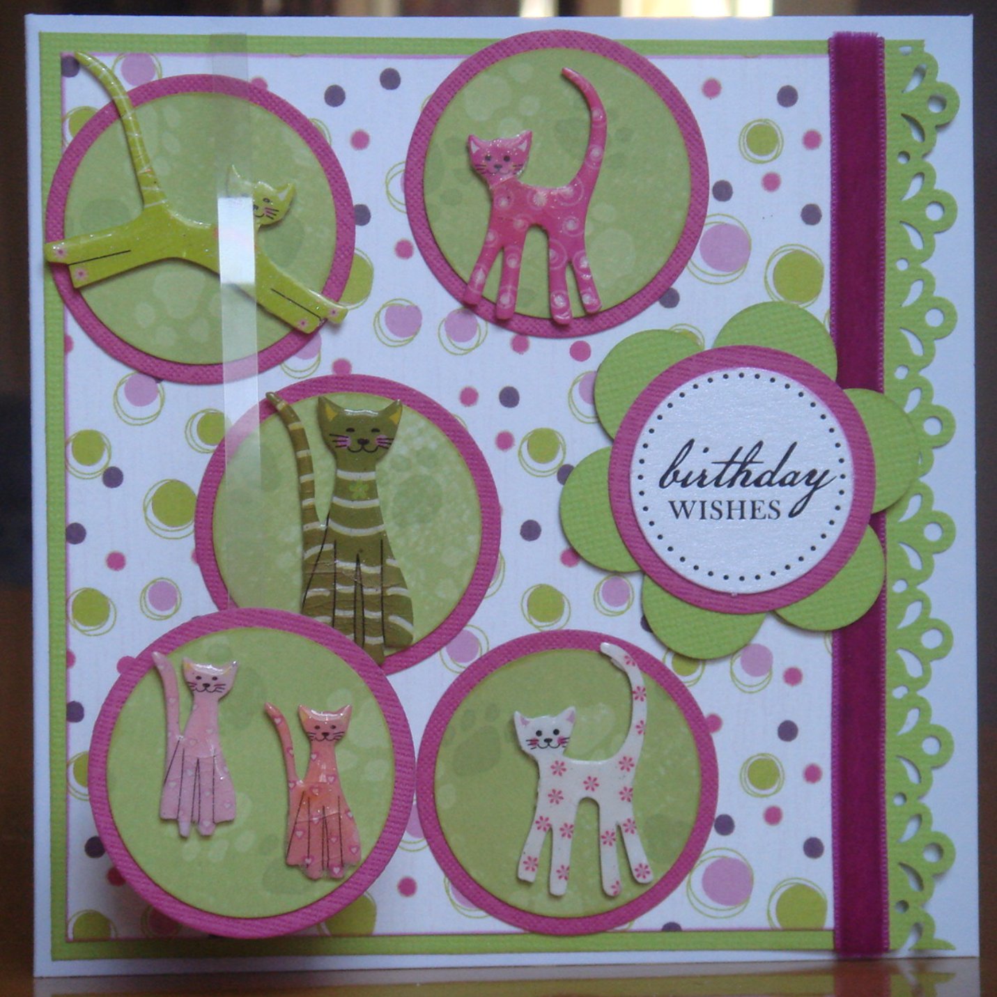
I made this card for my niece's eighth birthday, which was earlier this week. It uses quite bold shades of lime green and a deep purply-pink. The combination of its design and theme (cats) is one that I've been evolving over about a year now. Although I was happy at the time with each of its first two incarnations, it was the third, which was a birthday card for a similar aged girl about a month ago, that I felt was when I got it just right. (The three previous cards are at the bottom of this post.) I only tweaked that third card slightly for this fourth card. I think this will be the last time that I use the design for a cat-based card, as I've run out of cat obsessed friends and family, but I can imagine revisiting the layout for a different theme. Not really sure why I've only used the layout for cat cards up to now ...

The cat embellishments are Papermania die-shapes, very aptly titled "Fun Cats", each of which I heat embossed three time to give them gloss and depth. It's quite a fiddly process for such small pieces but worth the effort and I find an emery board is very useful to smooth down any rough edges. As has become my habit for cards recently, I attached one of the circles (bottom left) to a 5 mm strip of acetate, and tucked the other end behind the backing card, to provide some additional dimension and movement.

These are the three earlier versions of this card theme and content, which have been made separately over the course of about a year. Seeing them together like this (for the first time), I find it interesting - and encouraging - how the layout and techniques have developed over time, but surprising that the colour combination has varied so little.

Sunday, 7 August 2011

Sweet as Sugar

This week's Docrafts Creativity challenge is an inspiration one, with a nostalgia-provoking photograph of some Love Hearts sweets. When making cards for challenges, it usually helps me to have a recipient in mind (and stops me accumulating even more cards waiting for just the right occasion …). For this challenge, the recipient will be my mother. Had my father been alive, it would have been my parents' Golden Wedding anniversary next week. I wanted to send my mum a card to let her know that I was thinking about her especially at what could be a sad time. "Love You" seemed just the right thing to say.

The colours in the photograph immediately reminded me of some paper that I had in my stash, so I was off to a speedy start. I thought I'd repeat the dangling of an element in front of the main card, which had worked well for my nephew's birthday card a couple of weeks ago. I'd tried to explain orally how this looked to my mother but didn't think I'd got it across all that well. Now I'd send her one of her own and hope that makes it clearer.

The background paper was quite busy so I didn't want to make things too complicated but the pair of "danglers" wasn't enough on its own. Also, I wanted to include something that represented the sweets. I punched about a dozen small hearts from various parts of a multi-patterned paper and intended to punch their circular backings - but my smallest circle punch was not quite big enough and the next smallest was too big. A kind of a Goldilocks moment. Nestability die cuts to the rescue. The smallest circle was just right and so I embarked upon repeatedly putting textured white card through my Cuttlebug. It was a great boon that the machine works in both directions, although re-assembling the plate sandwich for each pass was much more fiddly and time-consuming than using a punch would have been … but that wasn't an option.

I inked the edges of everything with a really old tired pastel pink inkpad that is always in my essentials box - such a useful colour. It has a bit of a chalky feel to it, which seemed to match that of the sweets - at least in my memory. Can't quite recall how they tasted: not getting further than sugary! Were the different colours differently flavoured?

The small hearts were stuck flat on the circles, which were then mounted, in as random a manner as I could manage, onto the background paper using 1 mm foam pads. The acetate strips for the "danglers" were sandwiched between two larger punched hearts and secured to the card behind the backing paper. A single small heart mounted with a foam pad on one heart and a rub-on sentiment on the other finished off the card.


Quite a simple, but effective, card, I feel. Odd not to have used any ribbon; I found some suitable colours but they seemed unnecessary with so much stripy paper. I'm very pleased with the colours: I like it when pastels are bright and vibrant rather than really pale. And - an unusual outcome for my cards - it should travel through the post really well. Think Mummy will have a smile when she sees it. She's doing the church flowers in Daddy's memory this week and, most appropriately, has chosen a gold colour theme. Think it would have been weird though - and not in keeping with the challenge inspiration photograph - to use gold for this card. I did love making all those men's cards recently but it is nice to be back to prettiness as well as style and design.

Saturday, 23 July 2011

(Another) One for the Boys

Despite making cards for men being universally considered as the hardest task, I've just had a second success in one week. On Monday, I got inspired by this month's Get Funky! Boys Boys Boys challenge and made a card for my cousin's birthday next week, along with several spares for upcoming male birthdays. Today, having wimpily abandoned my plan to watch live cricket on the grounds of less than perfect sunny warm weather and the probability (which has been realised) of a Surrey defeat, I settled down to listen to the Lord's Test, watch Le Tour de France time trial and see if I could come up with something for the Docrafts Creativity challenge that Katy had set this week.

Katy alternates sketch layout challenges with inspiration challenges. This week's was one of the latter, which provide opportunities to be as creative as one likes, as long as there's something to link the finished product with the original photograph. Katy, either cheekily or cleverly, gave us a very Christmassy photograph, which has divided the entrants so far. Several took encouragement to start on their festive card making; others moaned that it was far too early and did anything but. I wasn't in the mood to make a Christmas card but didn't stand firmly in the latter camp either, having very happily knocked off 40-something of this year's Christmas cards in early-January.

I did like the five circles in a row component of the photograph and, particularly, the single element stood forward of the background. It came to me that each of the circles could bear a letter of someone's name (as long as it was five letters long) and that the forward element could be attached to the card on a strip of acetate, and so dangle in front, rather than being fixed flat. Running through my friends and relatives with appropriate names, I quickly came to my eldest nephew, whose birthday is in November. So, sort of planning ahead, but not quite as far as Christmas (155 sleeps to go, by the way). I hadn't necessarily intended to use the red and silver colours from the photograph but as my nephew's a Liverpool fan (no idea why; he lives in Somerset and his father supports Man City), it seemed a good plan.

Having decided to include letters, I then had to produce them. I thought about using some wrongly coloured chipboard ones as templates and cutting them out but was fearful that I wouldn't be able to do it neatly enough. I then remembered that I had bought a set of Papermania alphabet stamps a while back on the grounds that they were a craft box essential. So essential, of course, that I had never used them and almost forgotten about them! When I tracked them down, I also found an unused round "Happy Birthday" stamp, which gave me the start of an idea for the dangly component.

Progress from there was swift. I stamped the letters on textured red card with VersaColour silver (92) pigment ink and heat embossed them with Crafter's Companion metallic silver embossing powder. That combination of products gave a lovely effect, even though only single embossing was practicable. I backed the red circles with scalloped circles of textured matt silver card, which seemed to complement the embossing better than shiny mirror-board. I did indulge in the latter to back the sparkly red background and for the triple stripes, which seemed to add an appropriate sporty touch and were far easier to cut than I'd imagined. A pearly red gem in each of the cutaway corners and the basic card was done.


This just left me to make the dangler (for which I'm sure there's a more formal name that I don't know). Using a bit more mirror-board was an easy decision but I wanted to add some depth and weight to help it hang well. It occurred to me that fun foam might work well but I wasn't sure how to cut a circle from it. I knew that punches weren't up to its thickness but I wondered whether a Nestabilities die cut in the Cuttlebug might work. The answer, once I tried it, was with ease: result! I needed something to go in the dangler's middle: firstly to finish it off and secondly as I had got a smudge of silver ink there from the stamp. A silver sequin topped with a clear star gem did the trick. I toyed with adding a little ribbon bow but decided it wasn't quite the right colour red, which saved me the trouble of deciding whether a bow on a male card was appropriate.

Having visited the Crafter's Companion website to make sure I'd remembered correctly about the apostrophe and where to stick it (something of an obsession of mine), I discovered that their monthly challenge was One for the Boys. I thought I'd put this card in for that as well, as an example of their marvellous embossing powder, which I love. My only gripe with it is that the container lid isn't removable so getting the excess powder back into the pot - we crafters hate to waste anything - is a fiddly and time-consuming task. Perhaps the next release could have a screw top lid?

OK boys, you've had a more than disproportionate amount of my crafting energy and attention recently. I will gladly admit to having enjoyed it greatly, and having discovered layouts, styles and combinations that I can readily use for many purposes, but the next projects will be firmly focussed on the girls. They'll have to be: September is bursting girlie birthdays.  BTW, did you work out my nephew's name yet?

Monday, 18 July 2011

Boys Boys Boys

This month's Get Funky! challenge from Funky Hand is "Boys Boys Boys". Cards for men are almost universally held to be the hardest to make but with two male relatives having birthdays in the next few weeks, this was a timely challenge for me. As usual, the wonderful Anice provided a fabulous freebie paper and, although there is no obligation to use it, the colour and pattern combination made it irresistible.

Learning from my experience with this week's Docrafts Creativity challenge, I decided to go for simplicity in design but also to have another go at using the previous unfamiliar combination of squares and circles. The colours of the freebie paper came from the Jovial Man collection on the Papercraft Factory Colour Me Happy CD and I chose another pattern from that as my second paper. After that, it was simply a matter of cutting out squares and circles, inking their edges (obligatory!) and matting them onto complementary card. Anice had included stars on the freebie sheet and although I didn't use those, I liked the idea (and sentiment) of including a star so punched one out of card, inked it, topped it with a button and stuck it on. I was very glad to find that I had just the right colour of ink and style of stamp for a casual "Happy Birthday" greeting, using another of the collection's papers. The wooden mini-peg was not part of my original design but, having found it in my button box, it seemed to provide a slightly quirky yet appealing embellishment. Albeit one that's not necessarily going to travel well through the mail …

Pleased with how the finished card looked, I made a few more along similar lines using other patterns in the collection. Although blue and green is a combination that's not "supposed to be seen", it's one that I've always really liked, being based, it seems to me, on prolific colours in nature, and certainly works well for men. Thanks to the Get Funky! design team for the inspiration; that's my male card needs sorted for now and a few more to come, which is a great relief. Lots of female birthdays coming up at the end of the summer: any chance that next month's challenge could provide a useful starting point for them?

Squaring the Circle

Good weather, cricket and a holiday have distracted me from card-making for too long.  With Surrey out of the Twenty20 and the UK summer reverting to the usual cool, damp and dull weather, staying in and crafting became not just a feasible option but also a very attractive one.  Too much time pressure when making cards rarely, if ever, enhances my creativity but a deadline of some sort does help focus my mind.  I didn't have any particular cards in hand for the family and friends with birthdays coming up in the next month.  And, after a hectic week in mid-April, I also haven't done all that well (understatement) in taking part in online crafting challenges.  A wet Sunday afternoon (about which a complaint has been lodged with St Swithin on the grounds that his saint's day at the end of last week had been gloriously sunny, hot and, most importantly, entirely dry - at least in London) offered a good opportunity to address both.

The Docrafts Creativity website has a new paper-crafting challenge each Tuesday, with a Monday evening submission deadline.  I'm impressed by those who are able to get cards in on Wednesday or Thursday but suspect that I'm amongst the majority who submit late on Sunday or during Monday.  This week's challenge was a simple sketch outline involving a square set on a circle.  This is not a natural combination in my card-making as my preference is to keep curves and angles separate.  I had a pink and green colour way in mind - perhaps to balance the greyness outside my window.  A suitably shaped and sized topper in each colour came readily to hand, along with some co-ordinating papers.

Although I am pretty hopeful that the finished card will go down well with the intended recipient, I'm not entirely satisfied with the final card.  I like the combination of paper colours and patterns and think the ribbons work well, although it's a shame that so little of them remains visible.  I had originally intended to avoid using the card-maker's staple of mirror-card.  However, the papers alone looked a bit flat and adding just a little bit of silver card as a matting layer behind the topper and as flower and gem embellishments seemed to lift the design in a pleasing way.  I think the card is a bit cluttered and would probably have benefitted from being a little bigger overall.  The papers seem to dominate and distract from the topper itself; probably something less complex would have worked better.  However, this combination of a circle and square has a potential that I wouldn't have thought of myself.  With a simpler, and completely square, topper - perhaps an initial or a single shape - it would work well and I aim to try a variation along those lines.

I suspect that there is no creative project with which the creator has ever been entirely satisfied.  Looking back over my back catalogue of cards, I can see plenty of positive evolution in my style, designs and skills.  Those who have been at this much longer than I have frequently comment that they are always discovering and learning something new.  That's a big part of the joy of it and I trust it long remains so. Although I suspect (or is that hope?) that cricket and good weather will get in the way of me taking part in the weekly challenge for the next couple of weeks.

Wednesday, 13 April 2011

Zing Into Spring

My third, and last, paper-crafting submission this week is for Get Funky!, the monthly challenge from the Funky Hand design team members.  The challenge was to "Zing into Spring" using greens, yellows and lilacs - and, of course, at least one Funky Hand paper.  The latter is readily achieved, as its Papercraft Factory CDs are crammed full of gorgeous papers.  I chose nine designs from the Marching On collection on the Craft the Year Away CD.  Cutting these into squares, inking their edges and layering them on green card squares was straightforward.  Mounting the nine squares onto the card slightly less so.  Hint: take time to get the central square correctly positioned, then work up, down and across from it and place the corners last.  Pencilling a position number on the back of each helps preserve your carefully chosen layout as you stick them down.

At this point, my progress slowed down somewhat, as I couldn't decide what to use as a topper.  Knowing that lilac would be the main colour, I had intended a flower.  Initially, I teabag folded one from squares of two lilac papers.  It was pretty but overwhelmed by the background.  Next, I tried layering punched flowers from various lilac papers but that seemed too regimented and certainly lacked zing.  Then I remembered a gorgeous Creatables butterfly die and used it on lilac and lime card.  It's a very detailed die and needs to go through the Cuttlebug twice.  It then takes a bit of time and patience to poke out all the little bits of the design but is well worth the effort.

I definitely felt I was making progress by this stage but the lacy butterflies didn't stand out enough from the busy background.  The thought that I'd have to alter that was firmly pushed to the back of my mind.  I drew around the die and hand cut a plain butterfly from each of the cards. I edged both sets of wings with inks and layered them up, with contrasting hand cut bodies.  This looked promising, but the effect was still a bit flat.  I clear heat embossed the bodies and bent their wings up a bit and now they looked a lot more dynamic and fluttery.


Picking up my original floral plan, I punched some small lilac flowers, stuck tiny lime punched flowers in their middles and clear heat embossed each of them twice.  The end was in sight.  I punched some tiny lime coloured leaves, dabbed them on an inkpad to produce a variegated effect, randomly grouped the flowers and leaves together.  The finished result is quite a busy card but the colours bring the elements together well.  I'm pleased, and after I've submitted it to the challenge, it'll be on its way to my aunt for her birthday on Easter Saturday.

I've always felt that making cards to deadline cramps creativity but this week I've found that it's helped focus my mind.  A big part of that, I think, is having a brief to fulfil, rather than a blank card and a huge craft stash, which can be overwhelming.  I'm really looking forward to the next round of challenges, and trust that a short gap before embarking upon these will recharge my crafting batteries.  Time to pursue other activities for a while.

Monday, 11 April 2011

Three in a Row

Clare Curd presents paper-crafters with a weekly challenge each Tuesday on the Docrafts Creativity website, alternating between sketches and inspiration challenges. Encouraged by my first challenge entry yesterday, I resolved that today would see my second. This presented me with more than one challenge, as the submission deadline was 9 pm. Although I'd printed the sketch layout yesterday, I hadn't given any thought to what I might create until I got home just before 6 pm today. I resolved that supper could (and would) wait until I'd made my card, uploaded and submitted it and headed optimistically towards my craft stash

Happily, I found loads of bits and pieces that I could use. As the sketch design was very square and symmetrical, I wanted some contrast from my design and settled upon some girlie shoe embellishments for the basis of the toppers. Encouraged that meeting the deadline was achievable, I grabbed some co-ordinating ribbons and eyelets, picked up my bag of crafting essentials and headed to my laptop. The ever inspirational Funky Hand Papercraft Factory CDs provided me with just what I needed by way of interesting backing papers from the Lush Lilac collection of Dreams Come True. I then spent a gloriously happy hour or so cutting, layering and sticking, while the London sky outside darkened ominously.


The light was failing fast as I finished my card and snapped a photograph. It was tempting to head to the kitchen at that point and cook but I stuck to my resolve and 15 minutes later, all the technical stuff was done. A quick browse through the other entries indicated that it wasn't just me who had left it to the last minute. Several of the cards were gorgeous and I took a few moments to make complimentary comments about them. It's so lovely that almost as soon as one uploads a card to the gallery on the website someone will tell you how fab it is - thank you all - and it's a real pleasure to reciprocate when other people's creativity inspires me. Warm feelings all round, regardless of who wins.

I make a resolution to prepare earlier in the week in future but suspect that Monday supper might be more of a scrappy affair than a feast for a while. Who needs food when one has creativity? Now that's a diet that would work for me!

Sunday, 10 April 2011

Aqua and Brown

One of my driving forces in starting this blog was to get involved with the huge, expanding and dynamic network of creative people out there by entering some of my handcrafted greetings cards in online paper crafting challenges.  This weekend I decided to take the leap and enter my first one.  Having spent a while looking for friendly, approachable and encouraging sites and challenges, I settled upon this month's Crafter's Companion Challenge.  My reason for choosing it for my first foray was that the theme of the challenge was a somewhat unusual colour combination (aqua and brown) that I had just really enjoyed using to make both a Mother's Day card, which one of my friends sent to his mother last weekend, and a birthday card for a very good friend in Australia.  The latter is the one that I have entered for the challenge, although both appear in the "Latest Card Makes" slideshow on my blog.

The mermaid topper, which is from Lili of the Valley, was the starting point for the card design.  I love her gentle but knowing femininity.  I bet she never has a bad hair day despite spending so much time exposed to the elements!  Her sweet natured poise very much reminds me of the recipient of the card.  Having selected the mermaid, I then enjoyed trawling through my stash and finding suitably co-ordinating papers, ribbons and embellishments.  It was one of those great card-making moments when I didn't have a particular plan in mind but it all came together very naturally.  Looking at it now, just a day or so after entrusting it in the post, I can see where it could be improved - inking around the edge of the backing paper for a start - but it still makes me smile.  I hope it evokes the same response when it arrives on the other side of the world.