Pages

Saturday, 21 January 2012

January Blues

When I started thinking about this month's Get Funky! January Blues challenge, I still had last month's Thank You! challenge in mind, particularly the typography that Anice had used on the freebie paper.  I wanted to include the letters of Happy Birthday in individual circles and spent a very happy hour or so hunting online for just the right type to use until I stumbled across 4 Yeo In (from Urban Fonts), which seemed perfectly suited to my plan.


For once, I didn't use the freebie designer paper - although, of course, I have stashed it away for just the right rainy day! - but instead chose two papers from the Birthday Boy collection on the Funky Hand Papercraft Factory Happy Happy Birthday CD.  I manipulated one of them in the Workspace on the CD to have the same design in two different sizes and used another graphics package to colour match the sentiment to the backing paper.

Having printed the sentiment, I commenced upon the time-consuming process of cutting out the letters using a Nestability and my Cuttlebug.  Since there were thirteen letters to cut, I had hoped to be able to use a punch, which would have been soooo much quicker, but didn't have one in the right size.  I was able, though, to use one to cut out the backing circles to give a narrow darker blue border.  Then it was on to the fun messy task of inking the edges of all those little circles and layering them up.  I used a border punch to produce some paper lace and made a 1 cm paper ribbon.  I originally tried layering a circle in the centre of the card but it seemed to take up too much space so I swapped it for a square.  More edge inking and layering followed and I was then ready for assembly.

I chose little buttons over paper flowers for the embellishments and decided not to add thread through their holes, as it looked overly busy.  For the same reason, I put the three colours of the buttons in the same order on each corner, as I couldn't make a random arrangement of them look random.

Since it was obvious what the sentiment said (I hope!), I decided that it would be fun to arrange the letters in a bit of a haphazard manner, which helped a lot as the two words are of such different lengths, and mounted the circles on 1 mm foam pads to give a bit of depth.

IMHO, at least, a simple, pleasing (and certainly blue) card, that could be sent to a guy or a girl, although I'll probably go for the former … and, amazingly, finished, blogged and entered well before the challenge deadline.  That gives me plenty of crafting time to devote to some birthday cards that I've been itching to make, based on my Thank You! challenge design, with the recipient's name in place of the original sentiment.  Should work well, I think, at least for those with short names! And, luckily and very obligingly, that's exactly what my friends and family with February birthdays have.  Watch this space.

Friday, 13 January 2012

Thank You!

I loved the Funky Hand freebie backing paper that Anice designed for this month's Get Funky! Thank You! challenge as soon as I saw it in mid-December. I had intended to get going on my card straightaway … but find myself (probably not for the last time) posting my entry with not much more than 24 hours to go to the deadline. I'd like to attribute the delay to great creative processes but the truth is that a firm idea of how I wanted my card to look only came to me yesterday. Happily, this was one of those occasions when the transition from design concept to realisation was smooth, speedy and straightforward. The basis of the card has come out looking much as I saw it in my mind … and the finishing touches that can only happen in the actual making process all worked well (IMHO, at least).


My first printing of the backing paper produced a very poor facsimile of the digital original with dull insipid colours … but once I'd replaced the yellow cartridge on my printer (clearly, one can to too far in trying to use the very last dregs. To be fair, the warning's been there for at least two months), all the gorgeous vibrancy was revealed. Having cut out the tiles for the eight letters of "Thank You", I am left with enough on the single sheet to make at least three more cards. I inked the edges of each tile with a very faded black chalk ink and, finding that I very much liked the combination of pastel and black, went on to freehand doodle on them all with a very fine black pen. I cut backing tags from scraps of co-ordinating pearlescent cardstock and ink edged them as well. I used my lovely lime green Crop-A-Dile (one of my favourite craft tools) to punch little holes and secure a pastel eyelet in each. I tried to be as random as possible with the colour combinations of tiles, tags and eyelets.

I have thought for a while that Funky Hand papers would go really well with Kraft cards and the shabby chic style that was developing seemed to provide the ideal opportunity to try out the combination. To attach the letter tags to the card, I used short lengths of fine waxed black cotton cord, secured with little layered flowers punched from the same pearlescent card, leaving the ends loose to add to the casual style. Ink edging the flowers and their centres was somewhat fiddly and time-consuming, but without it they looked too "clean" alongside the ink edged letter tiles and tags. I found rolling them over the surface of the pad to be effective, although it was also good at getting ink on my fingers, face and the cat. Never mind, it washed off me pretty easily and the cat didn't seem to mind the taste of ink as she attended to herself. I used 1 mm foam pads for the flowers, which gave the tags a chance to move a little. I had intended to use the letter tags on their own, and originally arranged the "You" on the right side of the card. I quite liked the effect, but it looked a little stark, which didn't seem in keeping with the sentiment, so I made a few extra flowers - and, of course, got inky all over again in the process. Surely, the best crafting is the messiest? The extra flowers were grouped and mounted on a combination of 1 mm and 2 mm foam pads on either side of the centred "You".

I usually have someone in mind when I make a card, even for a challenge, but didn't on this occasion. I'm hoping, however, with a birthday coming up in just a few days, that I might be able to use it very soon … So, first card and challenge of 2012 most enjoyably completed; here's to plenty more.

Saturday, 31 December 2011

Reflections on a Year of Cricket

Well, there's no contest - or suspense - about my best cricket moment of 2011, but it has been a great cricket year for me and there are plenty of other great moments and memories - many of them "firsts" - that I am enjoying recalling and reliving.

  1. England Retain the Ashes Down: 7 January 2011
  2. Having won the Ashes in England in 2009, after losing them so comprehensively in Australia in 2006/7, I hardly dared imagine that we might retain them in 2010/11 but, for once, one of my dreams came true and there I found myself on 7 January 2011 leaping around and screaming with joy as England secured a 3-1 series victory. Oh, and did I mention, that the final wicket was taken by a (real) Surrey man?  Great work Mr Tremlett.  What a way to start the year.
  3. First Day of Domestic Season: 8 April 2011
  4. This year, the first day of the season was bright, dry, sunny and warm - and I was at The Oval for the first day of Surrey v Northamptonshire.  I found myself in sandals, shades and cropped trousers, rather than a fleece, gloves and boots, and eating my lunch sunbathing on the outfield.  Despite Surrey losing the first wicket of the season second ball, it was a fabulous day to start the season: one that I dared to dream would end in Surrey securing promotion to Division 1.  
  5. Number One Test Team in the World: 13 August 2011
  6. By beating India, by an innings and 242 runs, England claimed the accolade of Number One Test Team in the World.  According to my Facebook posts, it suddenly occurred to me that afternoon that I was watching England playing cricket and not feeling any nerves at all.  What an odd sensation!  A few minutes later, as the victory was secured, I was quoting Richard Thompson lyrics ("I feel so good I'm gonna break somebody's heart tonight") and completely forgetting all the pain, misery and despair of so many England collapse, thrashes and humiliations over the years.  And, just eight days later, there I was, on the top balcony of the Oval pavilion, as England secured a 4-0 series victory and were presented with the Number One Team mace.
  7. Surrey Secures Successive Successes: 14 & 17 September 2011
  8. Despite fizzling out somewhat in the Twenty20 competition, Surrey ended the season as CB40 champions and secured promotion to their rightful place in Division 1.  As part of my deal with the cricket gods, I was on holiday in Greece for both of these events and had to follow the progress of the matches through the BBC live website commentaries.  Felt all of the tension and the joy - but really missed celebrating with other cricket fans.  And, no big little bruv, despite growing up in Somerset, I did not feel conflicted for the CB40 final.  Of course, if the result had gone the other way, I might have taken some consolation in my second favourite team's success …
  9. Watching at Other Grounds: 27 April, 19, 21 & 22 May, 26 June, 4 & 24 July 2011
  10. As well as my beloved Oval, I watched Surrey play at Lord's, Beckenham, Whitgift and Guildford this season and had most enjoyable and different experiences at each.  Thanks to the marvellous weather that prevailed throughout most of the season, all offered great sunbathing opportunities as well.  And, on the first day of the Surrey v Middlesex match (the result of which (a) is best forgotten and (b) will not be repeated in 2012), we were allowed onto the hallowed turf at lunch and tea.  Food and drinks, however, were forbidden, so I wasn't able to indulge my picnicking on the outfield fetish.
  11. Watching T20 from the OCS Stand: 8 & 14 July 2011
  12. This was my first season as a Surrey member and so the first occasion that I was able to watch T20 cricket from the marvellous OCS Stand.  The views (across London as well as of the game) are fantastic, it's a great place to interact with other members and gave me ample opportunity to wave my Lions flag.  For a county match, I'd still rather watch from the Peter May but enjoying cricket from the dizzy heights of the OCS was a more than adequate substitute for T20.
  13. Meeting Captain Fantastic: 4 May 2011
  14. Thanks to a Simon Hughes competition on Twitter, I won two tickets (actually, won one and blagged the other) to an evening reliving the 2010/11 Ashes at a west London sports club.  Mr Strauss was very relaxed and entertaining as Simon Hughes quizzed him through the highs - and occasional lows: there was that third ball dismissal in Brisbane remember - of the series, while we ate Thai curry, drank wine and, it has to be said, shivered a bit: it was an early-May evening in a marquee in London after all.
  15. Watching an Entire Championship Match: 10-13 July 2011
  16. For the first time ever, I watched an entire Championship match, as Surrey played (and beat!) Kent at the Oval in early-July.  Zander de Bruyn scored an amazing 179 in the first innings, Rob Key fought back bravely with 162 batting fourth, the margin of victory (21 runs) was much tighter than my nerves would have liked, it was roasting hot on the early days and I was back to shivering, huddling in layers and clutching hot coffee for warmth through the tension of the fourth morning.  But I'd watched, followed and enjoyed an entire match live: the first time since England v Australia the SCG in January 2007.  Not much enjoyment in the latter, of course!
  17. In the Lord's Pavilion: 7 July 2011
  18. Surrey played Middlesex in a Twenty20 match at Lord's on a July evening and, courtesy of a cricket mate who is both a Surrey and a Middlesex member, I watched from the Members' Pavilion and saw Surrey achieve a 9-wicket victory.  It felt very different to being in the Oval Pavilion and not where I'd want to watch all my cricket but it was a great experience - and there was Sky TV evidence to reassure my mother than I'd worn a proper summer frock and so not given fuel to the press comments at the weekend that the overall standard of women's dress that evening left something to be desired.  I was a bit cooler than I'd have liked as a consequence though …
  19. Riding the Zip-Line at The Oval: 9 October 2011
  20. OK, strictly, this isn't a cricket highlight - but it did take place at a (should that be the?) cricket ground and I only found out about it through an email from Surrey.  Me and my girl pal rode the 500 ft zip-line from the top OCS balcony to the bottom of the Pavilion. Again, it should have been only once but we smiled sweetly and got a second go.  The only thing that could have improved the experience would've been if cricket had been being played at the same time.  Perhaps one for next year?
It's undoubtedly been very successful years for both Surrey and England, and I've enjoyed that muchly. But what's really made this my best ever season is how much of it I've been able to enjoy first-hand. My first year as a Surrey member has been a great experience. Thanks to everyone - players, stewards, other members and cricket Tweeters - who've contributed to that in so many ways. Here's to more of the same of in 2012!

Monday, 12 December 2011

Twelve Crafters Crafting (Part 2)

Having fairly quickly knocked off the first part of this month's Get Funky! challenge, set by Jackie of the marvellous Funky Hand design team, I struggled rather to complete the second part. My non-Christmas card was a birthday card for my friend Cilla, which was also my first waterfall card. At the time of making that, I had intended that my Christmas card for the second part of the challenge would be to my 2011 Christmas card design, using the required traditionally coloured papers from Funky Hand's new CD: Twelve Crafters Crafting. Much as I love the gorgeous design papers, I couldn't pick quite the right combination. After a few days, I decided that I'd utilise the same waterfall design but instead of using the "O Christmas Tree" collection, I'd use "Vintage Christmas".

I was able to make a couple of improvements to the construction of my second waterfall card: primarily, attaching the waterfall mechanism to the backing paper and card before fixing the whole thing to the card blank, which meant that the securing brads were more neatly hidden than on the first.  Otherwise, I used "gold" rather than "silver" accessories and made the mechanism slightly larger on the second card to accommodate the size of the star stamp.

I prefer the birthday card to the Christmas card, because the aqua and brown colours of the former are much more "me" than the traditional green and red of the latter. I don't really feel that either card is very much in the style of Funky Hand and I still think that I took the "easy option" with the birthday card by using the star design paper. However, I'm pretty hopeful that the Christmas card will be very much to my mother's taste and I'm glad that I didn't give up on what proved to be a much more challenging challenge than I'd originally anticipated.

Just a few more Christmas cards to finish and then my 2011 year of crafting will be done. It's been a year of great creativity. I've felt that I've developed my own style much more than before and have gained confidence and skill. Here's to more of the same in 2012! And that's about as close to a New Year resolution as I'm ever likely to get.

Monday, 21 November 2011

Twelve Crafters Crafting (Part 1)

OK, first of all, "thanks" (kind of …) to Jackie of the marvellous Funky Hand design team for this month's challenge. As if crafters didn't have enough to do at this time of year with making cards (due to some mid-winter festive event being just thirty four sleeps away … and, more pressingly, the last posting date for Australia only two weeks hence), this month's challenge wants us to present two projects. To be fair, I did make big early in-roads into my Christmas cards in January this year, when inspiration struck. Although they're not finished, I'm still happy with them and think (hope!) it shouldn't take too long to get them ready for posting. There are a few other designs that I'd like to try out … and I don't think I'll be able to resist and keep them for 2012! Must try harder to focus on the task in hand.

Speaking of which, back to this month's Get Funky! challenge, which is two projects (ie for me will be cards). One is to have a Christmas theme and use traditional Christmas colours (red, green, gold etc rather than the more contemporary pink, blue and purple - which I love) and the other is to be a non-Christmas project using Christmas papers. The challenge has been inspired by the recent release of Funky Hand's new CD: Twelve Crafters Crafting. Full of gorgeous design papers in a range of lovely colours … can easily see them gracing my cards.

As I might have mentioned once or twice, I've had a busy, and rewarding, autumn of card-marking and had just one more November birthday to go: my friend Cilla. I thought that I'd address this and combine the challenge with my long-standing wish to make a waterfall card from scratch. That's three birds with one stone, isn't it? And, so I did …


I've used three papers from the "O Christmas Tree" collection, which is a delightful combination of shades of jade, turquoise and brown. I love this mix of colours - and it's especially good at the moment as my printer's low on yellow ink due to all the autumnal papers I've printed and crafted with recently. I feel that I've cheated a bit - or at least taken the easy option - by using a star paper and one of the plain textured papers rather than anything more festively challenging. Apart from the stripes and spots, they are probably the least Christmassy of the collection. I have also used tiny bits of a third paper that has a snowflake background but have snipped carefully just to get the neutral dashed line. I'd usually have gone with some of the striped and spotted papers, which Anice always includes in her collections, but they are too busy for this waterfall design. Will use them on something else - especially the gorgeous striped one with hand doodles.

The waterfall mechanism is actually really simple: just a case of cutting a long enough strip, scoring accurately (2 cm gaps work well here with a 4 cm width), folding well, positioning the decorative elements carefully and fixing the whole thing securely to the card (belt and braces with brads as well as double sided tape). I've taken a bit of a risk using scalloped circles that are a tiny bit wider than the 4 cm squares on which they are mounted but they are moving well … so far. I'm pleased with how the holographic card and the silver embossed letters work with the browns and turquoises of the design papers. And am glad to have found scraps of matching ribbons in my stash to make the pull-tag. Another example of why crafters are right never to throw anything away! Embellishing with a few holographic stars added a little more to the Christmassy reference.

So, halfway there challenge-wise, and pretty happy so far … I think the Christmas card component will be to my 2011 design, but I haven't decided which papers to use yet. Happily, the closing date for the challenge is a week beyond the Australia posting date so I've got a bit of a breathing space there.

Sunday, 13 November 2011

Amble into Autumn

This month's Get Funky! crafting challenge has the theme of "Autumn". This seemed perfectly appropriate and very appealing, as I've been enjoying the autumn this year so much. It feels that it's been one of the best autumns ever: fantastic colours lingering long and bright in the trees, mild, still, dry and warm weather, and plenty of time to amble around London and enjoy being surrounded by it.

Over recent weeks - as part of my response to so many of my friends and family having birthdays and other occasions to celebrate in October and November - I've made several cards with an autumnal feel but only one of them with the Funky Hand challenge in mind. In fact, I would have felt uncomfortable entering the others for this challenge, as they are variations on two card designs that I put in for challenges earlier in the year: more details towards the end of this blog post if you're interested …

As usual, the amazing Anice designed a special freebie paper for the challenge's theme. It has a terrific falling leaves design and, although there is no such obligation, I really wanted to use it in my challenge card. Unsurprisingly, it tones brilliantly with the design papers in the "Orange October" collection of the Funky Hand Papercraft Factory "Craft the Year Away" CD. I chose three of the plainer papers in the collection: the same design in toning autumnal shades of brown, orange and gold.


The main image on the card is "Copper", who is a lovely fairy designed by Lili of the Valley. As well as being a very suitable autumnal colour, something about her reminded me of my only female cousin Sue, who will receive this card for her fiftieth birthday. I didn't want to include a 50 on the card but felt that the autumnal colours and the gold mirror board hinted enough in that direction. I haven't been using mirror board in my cards recently and rarely use it with Funky Hand papers but this time the combination seemed right.

I had the idea for the design of the sentiment element of the card when thinking about a card that I am yet to make for the ninetieth birthday of a friend of my mother's and am pleased that it's come out so well in reality. (Hope it does again when I repeat it for the 90th card.) After printing the three coloured papers, I put the sheets back into the printer and printed a different colour on the reverse of each. I cut several 6 mm strips from each, inked the long edges (fiddly and messy) and then cut each of those strips into lengths of about 7 cm. After folding each at an angle, I stuck them randomly around the reverse of a circle of gold mirror card and then trimmed the ends of each at an angle. Inking the cut ends of these paper "ribbons" was fiddly but worth the effort, as it makes them look finished - and avoids those "nasty" white edges! I stamped the circular sentiment, added a small gold circle and two tiny gems. I was reasonably pleased with the effect but felt it wasn't quite finished. Nervous of doing too much, I put it to one side while I assembled the rest of the card.

I fixed three paper ribbons to the left of a square of the leaf backing paper, tucking the ends under for neatness. I punched away three corners of the square and matted it onto gold mirror card, with the narrowest border that I trust myself to achieve, and mounted it onto a cream 13.5 cm square card. The sentiment rosette was mounted over the ribbons with foam pads and a circle of the orange paper layered between two gold circles put flat at the bottom right corner of the card. Onto the layered circles, I attached Copper the fairy, whose edges I had inked (using a cotton bud for the most fiddly bits), with foam pads. A few touches of yellow Sakura gel glaze pen brought out the centres of Copper's flowers and I added a tiny gem to her necklace. I thought about using something glittery to emphasise her fairy-wings but felt that that was going to be a texture too far. Once again, following the crafter's golden "rule of three", I put three tiny gems into each of the three cutaway corners.

The card looked pretty good (IMHO) but didn't feel quite finished: there still seemed to be a gap in the centre of the sentiment and a bit too much backing paper showing. I recalled having some flowers left over from one of my other autumnal cards: coincidentally made for my aunt - my cousin's mother. Typical of a crafter, I had saved them and - amazingly - was able to find them. For my aunt's card, I had put tiny punched flowers in the centre of slightly larger ones and then heat embossed each several times. I had thought that all I had left was the punched flowers but was really pleased to find that there were four assembled and embossed. Perfect! One for the centre of the sentiment and the other three (that rule again) scattered over the background.

Then I felt that the card was finished and ready to make its way to Sue for her birthday next Thursday. Time to turn my hand to cards for two friends who also have birthdays that day: one of them lives in Luxembourg, so I probably ought to have posted a few days ago … oops!

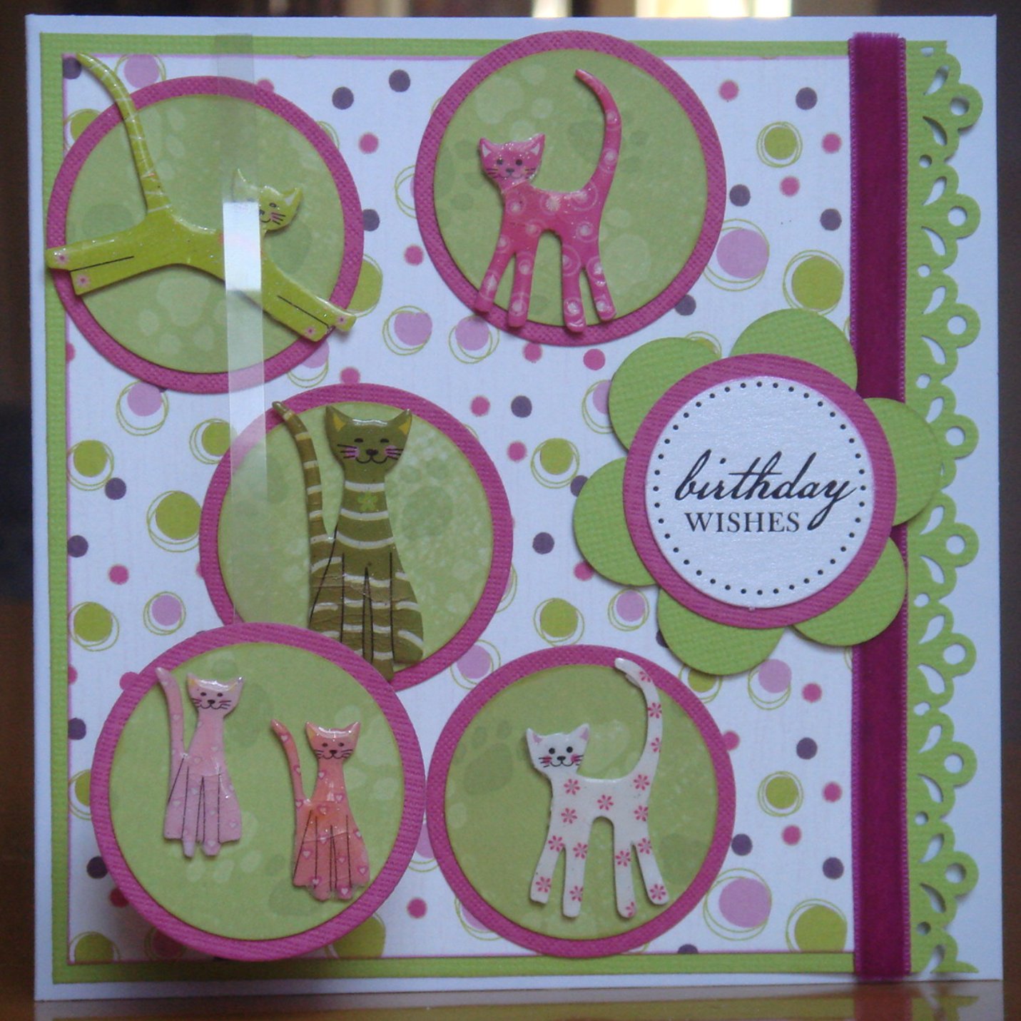
As promised, here are the other autumnal cards that I have made. The butterfly one was for the one for my aunt - Sue's mum - that resulted in the leftover flowers. It is similar in design, albeit very different in colours, to the card that I made for my other aunt's birthday in April. Part of my inspiration for the original card was the Get Funky! "Zing into Spring" challenge. There is something very satisfyingly symmetrical for me in making similar cards for my two aunts, although it happened by coincidence rather than plan.

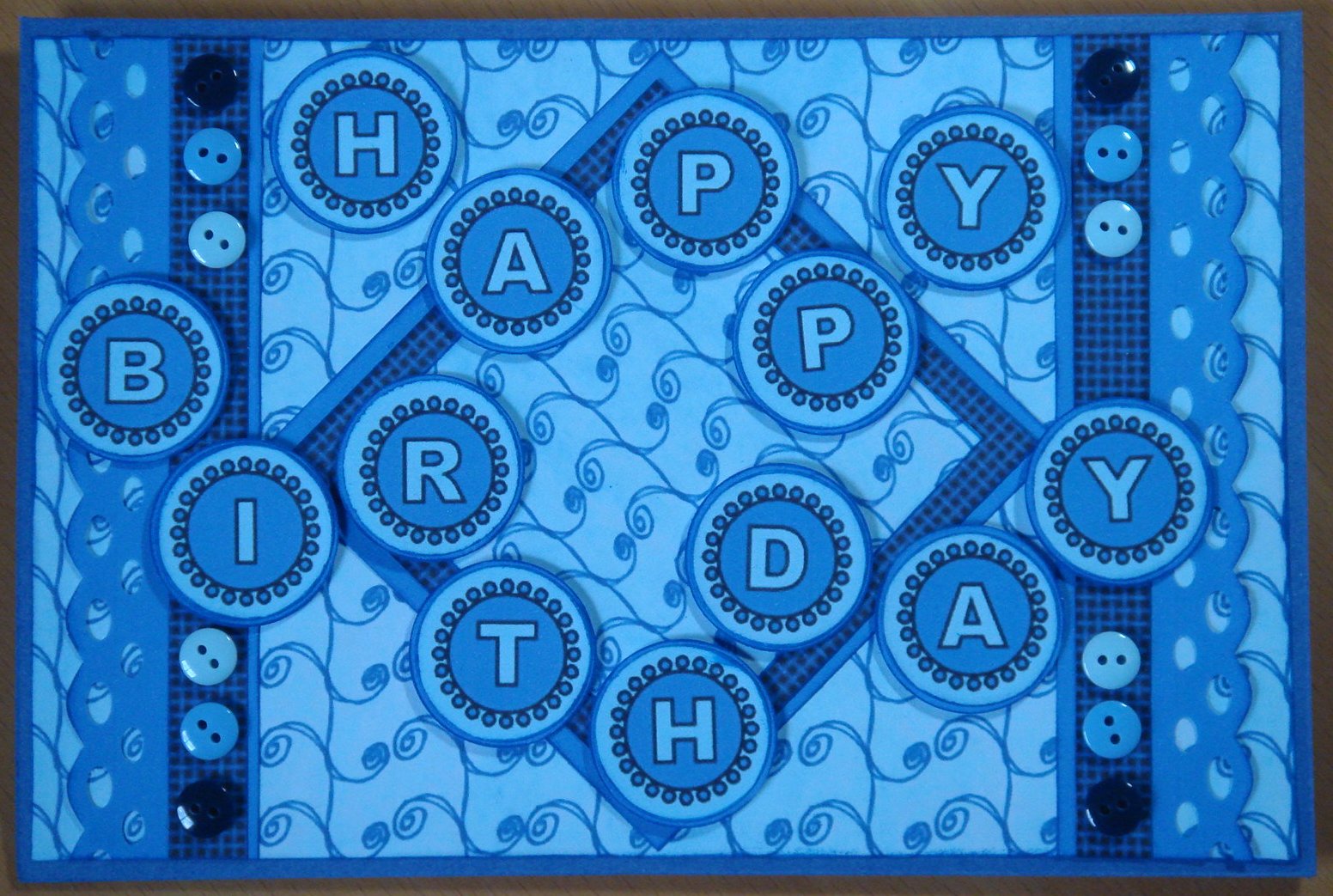
The other card is for a female friend's birthday (next Wednesday) and uses my modal design of the year, which was first made for the Get Funky! "Boys Boys Boys" challenge. She's a very sporty, outdoors kind of a woman, and the autumn colours remind me of that side of her character. It's also her fiftieth birthday and, as with Sue, I didn't want to emphasise that but also not to ignore it entirely. Thinking about it now, I suspect that neither woman is overly sensitive about her age (they are both practical, get on with it kinds) and it's how I feel about numbers on cards that has led me to leave them off. They're great at the bottom and top of the age range but don't work - at least for me - in the middle.

Sunday, 30 October 2011

Pink and Green

Interesting colour combinations are one of the most enjoyable aspects of card-making for me. The inspiration for them comes from so many sources: the preferences of the person the card is for, the colours in a paper, image or embellishment or those suggested by a theme. Sometimes the combination is challenging, particularly those that I haven't used before or wouldn't usually think of putting together, and at other times they just seem natural and irresistible. This month's Crafter's Companion Challenge fell into the latter category: pink and green is one of my favourite combinations, due, I think, to its prevalence in nature.


I made this card for my niece's eighth birthday, which was earlier this week. It uses quite bold shades of lime green and a deep purply-pink. The combination of its design and theme (cats) is one that I've been evolving over about a year now. Although I was happy at the time with each of its first two incarnations, it was the third, which was a birthday card for a similar aged girl about a month ago, that I felt was when I got it just right. (The three previous cards are at the bottom of this post.) I only tweaked that third card slightly for this fourth card. I think this will be the last time that I use the design for a cat-based card, as I've run out of cat obsessed friends and family, but I can imagine revisiting the layout for a different theme. Not really sure why I've only used the layout for cat cards up to now ...

The cat embellishments are Papermania die-shapes, very aptly titled "Fun Cats", each of which I heat embossed three time to give them gloss and depth. It's quite a fiddly process for such small pieces but worth the effort and I find an emery board is very useful to smooth down any rough edges. As has become my habit for cards recently, I attached one of the circles (bottom left) to a 5 mm strip of acetate, and tucked the other end behind the backing card, to provide some additional dimension and movement.

These are the three earlier versions of this card theme and content, which have been made separately over the course of about a year. Seeing them together like this (for the first time), I find it interesting - and encouraging - how the layout and techniques have developed over time, but surprising that the colour combination has varied so little.